Here is a cool site I stumbled upon, and I'm not sure the coding/techonology that's being used, however, it's awesome. It destroys the quickly disappearing myth of trying to design "above the fold" and instead using scrolling as a narrative feature.
Ben the Body Guard
Sunday, December 5, 2010
Thursday, October 7, 2010
Animated Interpretations of Paul Rand
Being as Paul Rand is one of my favorite designers, and design thinkers, I found this video –seemingly done in flash only– to be quite inspiring. It also sinks up quite flawlessly with the sound/music.
Sunday, September 19, 2010
Court TV Title Sequences
A nice compilation of 3 title sequences from Court TV. I definitely dig the use of sound and dimensional space in conjunction with the type as image aesthetic.
Enjoy!
Enjoy!
Thursday, September 16, 2010
Good use of After Effects
The music is unbearably bad, but I really appreciate the use of creating a 3d environment, and it's use of (mostly) type only elements to do so.
Monday, September 13, 2010
Technology & Graffiti for people with physical impairments.
“Art is a tool of empowerment and social change, and I consider myself blessed to be able to create and use my work to promote health reform, bring awareness about ALS and help others.”
– Tempt One
– Tempt One
Wednesday, September 1, 2010
99% Conference 2010: Motion Graphics
This is an incredibly beautiful piece by Stefan Sagmeister, Jack Dorsey, Antenna Design, and John Maeda created during the 99% conference.
Visually the piece is stunning, however the timing makes it next to impossible to read the quotes, and the music seems quite disconnected from the animation.
The use of geometric shapes, and flawless executed typography look like great starting points for this project.
Enjoy!
99% Conference 2010: Motion Graphics from 99% on Vimeo.
Tuesday, August 31, 2010
Look Through a Complex Eye and See 1000 of Everything
I found this video on Born Magazine's website. It's a particularly nice video, that combines photography, vector illustration and really beautiful type -juxtaposed with haunting music. It's a beautiful little -simple and to the point. The piece uses a poem by: Zachary Schomburg.
Enjoy!
Monday, August 30, 2010
How Multimedia is Changing Branding
This is a really interesting article written by Luke Hayman from Pentagram.
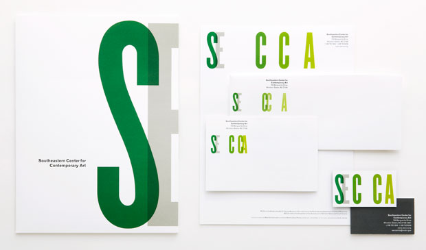
In this article, Pentagram unveils a new logo in which the idea of moving type becomes core to the brand standards of the client. The digital version of the logo, the one moving, is the truest version of the logo. The printed version of the logo seeks to replicated the animated version that lives in the digital space.
Conceptually, it's intriguing. The moving type is a gesture to the influx nature of the gallery that the logo represents.
Pentagram took the concept further by printing multiple iterations of the stationery in which the letters live in different spaces within the environment.
Here is the original logo, followed by the new digital logo, and it's printed counterparts:

Subscribe to:
Comments (Atom)


