In this article, Pentagram unveils a new logo in which the idea of moving type becomes core to the brand standards of the client. The digital version of the logo, the one moving, is the truest version of the logo. The printed version of the logo seeks to replicated the animated version that lives in the digital space.
Conceptually, it's intriguing. The moving type is a gesture to the influx nature of the gallery that the logo represents.
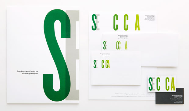
Pentagram took the concept further by printing multiple iterations of the stationery in which the letters live in different spaces within the environment.
Here is the original logo, followed by the new digital logo, and it's printed counterparts:

this is very interesting, and definitely something that i've never thought of before. thanks for sharing.
ReplyDelete